Recently I got to work, as a subcontractor, on a street map for a US educational institution. My task was to label street centerlines, using MAPublisher and LabelPro. This was my first real project using LabelPro so this would be a good test case.
I loaded up the road centerline data, which was not classified by type, and set up some rules for this. Using 9 pt Helvetica Neue, 55 Roman, as font.
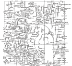
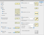 When I examined the results of this first run, I noticed that it seemed to be very “leader line happy”. I have not shown the unplaced labels in this particular sample (for the sake of the argument that I’m trying to make, they don’t really matter that much anyway).
It quickly became obvious that if I’d want the best results out of LabelPro, I would have to prepare my data. a “one set of rules fits all” approach clearly wasn’t going to work. I decided to split my data into 4 different categories.
 These categories are then each set up with a different set of rules, so that I can more accurately influence the way they’re being labelled.
- Interstate – There’s one interstate running through this area. Its segments have a road name, which basically is the interstate number. I simply don’t label this one at all, instead I will be manually placing an interstate shield later on. Note that I can do this with LabelPro as well, but since there’s only one, it would take more time to set up the rules for it than it would to manually place 2 or 3 shields. So I manually select the interstate and its on- and offramps and put them on a new layer.
- Major roads – There’s several major roads present. I want to make sure they’re labelled the clearest, with the highest priority. So again it’s manual selection and putting them on a new layer. This one gets labelled with a higher initial font size and no leader lines.
- Regular streets – No leader lines either, plus I’m going with a condensed font rather than the regular roman version. Unfortunately you can not instruct LabelPro to try and mix both versions of a font.
- Short streets – Selecting on the Length attribute that MAPublisher automatically generates allows me to seperate the short streets from the regular ones and set them up with a different set of rules. Again a condensed font, but it’s even smaller than the regular streets and now leader lines are allowed. Hopefully this will reduce the amount of leader lines cluttering up the map. I’ve set the treshold for short roads at 400 feet.
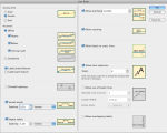
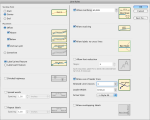
The rulesets I created for these layers are as follows:
Major roads:
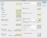
Regular roads:
Short roads:
The main LabelPro interface, where I’ve specified the priorities and fonts to be used, looks like this:
Finally, the result that we’ve all been waiting for. As you can see, there still is a need for some manual editing, but the overall image is a lot less cluttered than 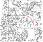 the first run. I did change the color for the streets for legibility. Instead of 100% black it’s now only 75%.
Reducing the number of roads where leader lines are a valid option makes for a much clearer result. In retrospect, I think I might even want to limit it to dead-end streets and cul-de-sacs.
I think it’s important to keep in mind that LabelPro is a tool, not a magic box that’ll deliver perfect cartographic text placement. Even with the manual editing that’s necessary to make this map look finished, it’s still saving me a lot of time. Also, since the label text is taken directly from the attributes, there’s less chance of typos or other mistakes (assuming the source data is good of course). Of course the rules you have to set are very much influenced by the local topography and what I’ve done here may not apply to your maps. Still, it pays to experiment.

You must be logged in to post a comment.